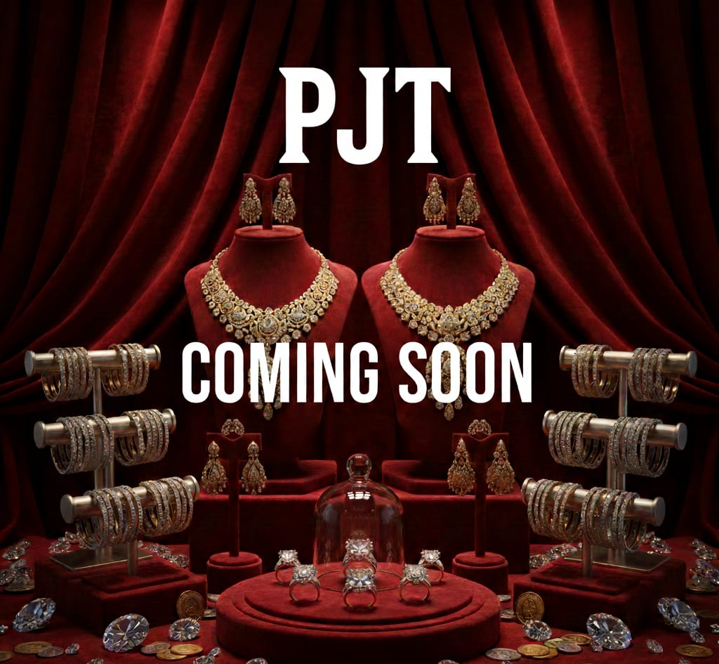
1. The Power of Anticipation
The "Coming Soon" messaging combined with the heavy red velvet curtains creates a theatrical sense of mystery.
The "Tease" Factor: Discuss how brands use mystery to build hype. By not showing the full brand name or specific launch date, they encourage followers to stay tuned.
Visual Storytelling: The curtains suggest a stage, implying that jewelry isn't just an accessory—it's a performance or a masterpiece 2. Opulence and Color Psychology
The color palette is very deliberate and carries deep psychological weight.
Royal Red: Red is the color of passion, power, and luxury. In many cultures (especially South Asian), it is also the color of weddings and celebration.
Gold & Diamonds: The contrast of the warm gold and the bright "ice" of the diamonds against the dark velvet makes the products pop, emphasizing high-end craftsmanship.
3. Heritage Meets Modern Luxury
The style of the jewelry looks like a blend of traditional craftsmanship and modern sparkle.
The Collection: You have everything from heavy statement necklaces (Polki or Kundan style) to stacked bangles and intricate rings.
Curation: Note how the symmetry of the image—two busts, two earring stands, two bangle racks—creates a sense of balance and perfection.
4. Design & Branding Elements
If you’re writing about the design specifically:
Typography: The bold, clean, white serif font for "PJT" stands out against the busy background. It feels modern and authoritative.
Lighting: The "spotlight" effect on the central display pieces draws the eye directly to the most intricate work first. #WHAT SHOWS OUR JEWELLERY IS BEST ; OUR JEWELLERY SHOWS OUR HANDCRAFT AND TRADITION OF MAKING JEWELLERY WHICH WAS CUSTOMIZED BY THE CLIENTS FOR THIER OWN WHICH GIVES THEM HIGH SATISFACTION AND SUCCESS.